Community Forum
Which one should I use? Need opinions
-
TallPines
- Posts: 89
- Joined: Wed Jun 08, 2022 9:12 pm
- Visit My Farm
 Which one should I use? Need opinions
I've been wanting to find a distinguishing brand and finally found a couple fonts I like that will print in my horses names here on HWO 
I like them both but what do you think?
Which one do you like better??
The new brand will be on all horses bred by the Tall Pines team that includes Tall Pines, ShowCountry, and ImaCountryGirl
I will be adding this to all future TallPines bred horses and all those currently at my farms.
I thank you and appreciate everyone's opinion
I like them both but what do you think?
A] Tᗩᒪᒪ ᑭIᑎEᔕ
or
B] ⲦѦⱢⱢ ꝒƗՈΣꞨ
I like the first one because it's easy to read, but I like the second one because of it's unique style.Which one do you like better??
The new brand will be on all horses bred by the Tall Pines team that includes Tall Pines, ShowCountry, and ImaCountryGirl
I will be adding this to all future TallPines bred horses and all those currently at my farms.
I thank you and appreciate everyone's opinion
-
BlackOak2
- Premium

- Posts: 10575
- Joined: Sat Jan 30, 2016 12:41 am
- Visit My Farm
Re: Which one should I use? Need opinions
The second one is showing errors. Just those little squares when it's not supported, on the very first letter (I assume the T, and the last letter, the S). So I can't say for certain that the second one works, visually. It is a nice looking font though. Reminiscent of ... native... like things. Actually, also reminds me a lot of pokemon. 
That said, I also like the first one because it's visually easy to read.
My vote would be the first.
That said, I also like the first one because it's visually easy to read.
My vote would be the first.
Don't forget to check it out!
Quick Start Guide For Newbies
Link to additional information.
BlackOak2's Quick-Links
Quick Start Guide For Newbies
Link to additional information.
BlackOak2's Quick-Links
-
Diamond Filly
- Posts: 1484
- Joined: Mon Dec 26, 2022 6:02 pm
- Visit My Farm
Re: Which one should I use? Need opinions
I vote first. It's easiest to read.
-
el948wh
- Posts: 144
- Joined: Tue Sep 01, 2020 5:36 pm
- Visit My Farm
Re: Which one should I use? Need opinions
i like the second one better
-
TallPines
- Posts: 89
- Joined: Wed Jun 08, 2022 9:12 pm
- Visit My Farm
Re: Which one should I use? Need opinions
Thank you BlackOak;BlackOak2 wrote:The second one is showing errors. Just those little squares when it's not supported, on the very first letter (I assume the T, and the last letter, the S). So I can't say for certain that the second one works, visually. It is a nice looking font though. Reminiscent of ... native... like things. Actually, also reminds me a lot of pokemon.
That said, I also like the first one because it's visually easy to read.
My vote would be the first.
I've never played pokemon so I don't know about that
I've been using the Tall Pines prefix for quite some time and I want to solidify that breeding into a recognizable unique brand. With that said as much as I do like the second one I am leaning toward the first one because I think it's more practical. But I want to get some more feedback from others on how you all see it.
Right now it's 2 to 1
-
TallPines
- Posts: 89
- Joined: Wed Jun 08, 2022 9:12 pm
- Visit My Farm
Re: Which one should I use? Need opinions
TYel948wh wrote:i like the second one better
-
TallPines
- Posts: 89
- Joined: Wed Jun 08, 2022 9:12 pm
- Visit My Farm
Re: Which one should I use? Need opinions
TYDiamond Filly wrote:I vote first. It's easiest to read.
-
BlackOak2
- Premium
- Posts: 10575
- Joined: Sat Jan 30, 2016 12:41 am
- Visit My Farm
Re: Which one should I use? Need opinions
It's likely because my computer is a little older. I'd like to show you an example of what I see but since it's error on my end, it'll just pop up as not an error on yours!TallPines wrote:Thank you BlackOak;BlackOak2 wrote:The second one is showing errors. Just those little squares when it's not supported, on the very first letter (I assume the T, and the last letter, the S). So I can't say for certain that the second one works, visually. It is a nice looking font though. Reminiscent of ... native... like things. Actually, also reminds me a lot of pokemon.
That said, I also like the first one because it's visually easy to read.
My vote would be the first.
I've never played pokemon so I don't know about thatbut I do like all things native, which might be what I'm liking about the second one. I'm not seeing what you refer to on the T or the S in ⲦѦⱢⱢ ꝒƗՈΣꞨ The S is a little funky looking having a bar through the middle, but the T is just like a normal T except the top cross has little points that drop down from the ends. Is it showing errors on your end? I don't want to use something that could cause confusion.
I've been using the Tall Pines prefix for quite some time and I want to solidify that breeding into a recognizable unique brand. With that said as much as I do like the second one I am leaning toward the first one because I think it's more practical. But I want to get some more feedback from others on how you all see it.
Right now it's 2 to 1
But, maybe this'll work?
Ⲧ
Of course, maybe that looks like it should anyway.
I see it from time to time across the game, so I'm used to it. I only said something, because you want opinions and because it's showing me an error on the first and last letters of that second option, I can't offer a true opinion. That's all.
In pokemon, there's a type of monster that's built like letters and that's just about what they look like:

Site: https://www.pokemon.com/us/pokedex/unown
That particular one is an F. But they have the whole english alphabet as well as a couple others, including an exclamation point.
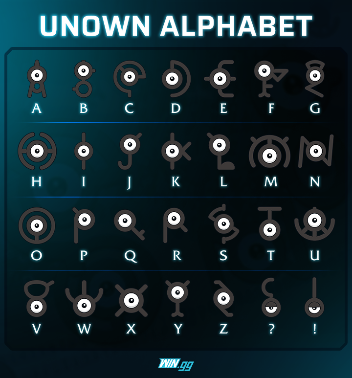
It's a neat little quest in some of those games. The ancient writing that uses the unown monsters, looks very, very similar to the font you chose.
Don't forget to check it out!
Quick Start Guide For Newbies
Link to additional information.
BlackOak2's Quick-Links
Quick Start Guide For Newbies
Link to additional information.
BlackOak2's Quick-Links
-
TallPines
- Posts: 89
- Joined: Wed Jun 08, 2022 9:12 pm
- Visit My Farm
Re: Which one should I use? Need opinions
LOL, yeah that looks like a regular T to meBlackOak2 wrote:It's likely because my computer is a little older. I'd like to show you an example of what I see but since it's error on my end, it'll just pop up as not an error on yours!TallPines wrote:
Thank you BlackOak;
I've never played pokemon so I don't know about that
I've been using the Tall Pines prefix for quite some time and I want to solidify that breeding into a recognizable unique brand. With that said as much as I do like the second one I am leaning toward the first one because I think it's more practical. But I want to get some more feedback from others on how you all see it.
Right now it's 2 to 1
But, maybe this'll work?
Ⲧ
Of course, maybe that looks like it should anyway.
I see it from time to time across the game, so I'm used to it. I only said something, because you want opinions and because it's showing me an error on the first and last letters of that second option, I can't offer a true opinion. That's all.
In pokemon, there's a type of monster that's built like letters and that's just about what they look like:
Site: https://www.pokemon.com/us/pokedex/unown
That particular one is an F. But they have the whole english alphabet as well as a couple others, including an exclamation point.
It's a neat little quest in some of those games. The ancient writing that uses the unown monsters, looks very, very similar to the font you chose.
There are probably others with older PC's that might have issue with that second choice also so I think I'm going with the first one
I have friends that were playing pokemon. They did seem to enjoy it. Thanks for the info about it. Interesting. Cool alphabet
-
TallPines
- Posts: 89
- Joined: Wed Jun 08, 2022 9:12 pm
- Visit My Farm
Re: Which one should I use? Need opinions
Diamond Filly wrote:Ping
el948wh wrote:Ping
BlackOak2 wrote:Ping
I have decided to go with this one
Tᗩᒪᒪ ᑭIᑎEᔕ
Thanks for helping me choose